One of the things that makes website design complex is that it’s always evolving.
Creating a good website is one thing. Creating a website that’s so great it will impress even the most veteran industry experts and clients is quite another.
That’s a goal that the most experienced designers and developers in the business never lose sight of.
One way to achieve it is to constantly stay up to date with the best website design practices and principles.
Get ready to level up with the 11 best website design practices and principles.
(Expert designers and developers, tips for you start at #4).
Contents:
- Website Design Principles: Don’t Ignore the Basics
- Website Design Best Practices for Intermediate and Veteran Designers
Website Design Principles: Don’t Ignore the Basics
Striving to be at the top of your game in UI or UX design?
No matter how much of a newbie or veteran you may be, there are a few web design principles you can never take for granted.
Here are three quick tips and practices that are must-knows for all designers and developers.
1. Design With a Specific Purpose
When building a website for a client, the most important thing is to have a clear understanding of the website’s purpose. Ideally, the client will already know how to write a web design brief that gives you the context you need. If they don't, the responsibility sits with you to get all the necessary details for the project.
Is the client’s goal to entertain? Sell products worldwide? Sell local services? Provide information through blog posts?
Knowing the end goal of the site is key, as the purpose of the site can determine how you develop and design for the client. The end goal also helps dictate content, imagery, CTAs, and other elements to create consistent brand messaging on all web pages.
2. Design for Quick Load Times
No one wants to wait 10 or 20 seconds for a site to load. In fact, most website visitors will click away if a page load takes more than 5 seconds. The optimum load time for a web page is two seconds or less.
There are a variety of ways to improve load times, like only using the most necessary plugins or compressing, optimizing, and resizing images, so they don’t slow you down.
The faster the load time, the less likely site visitors are to click away and find what they’re looking for on another site.
3. Optimize for Mobile Devices
Mobile devices account for nearly 60% of all web traffic worldwide, so if you don’t have a responsive website, don’t expect to see great conversion rates.
Responsive design is key in website design, so always be sure to design and develop for usability on all screen sizes.
Website Design Best Practices for Intermediate and Veteran Designers
It doesn’t matter how experienced you are in web design and development — new practices and tactics are always evolving.
Here are eight web design best practices for designers and developers of all skill levels — practices that can help you deliver a website that far exceeds your client’s expectations.
4. Make it Easy to Navigate
Never lose sight of user experience. Visiting a website should always be enjoyable. It should never be frustrating and it should never be complicated.
A website must be easy to navigate, no ifs, ands, or buts.
Easy navigation is a must for all sites, but it’s especially important for ecommerce sites that provide potential customers with a wide variety of products. The more options and choices the site offers the customer, the more important it is to help them narrow them down.
This is where Hick’s Law comes into play.
Hick’s Law states that the time it takes to make a decision increases with the number of choices available. The more options a website offers, the longer it will take for a consumer to make a purchasing decision.
For example, it will take a consumer longer to choose a pair of shoes on a website that sells 100 different styles than on one that has ten or twenty options available for purchase. The more options, the more considerations the consumer makes, the longer it takes them to make a purchase.
Web developers and designers can help customers narrow down their choices by creating better filters. Adding dropdown menus that let customers filter by color, by size, or by occasion helps customers find the product they’re looking for faster.

5. Keep It Simple
Visual appeal is just as important as function, and a strong visual impact makes a great first impression.
Pay close attention to all visual design elements, including typography, fonts, and color scheme. All fonts and type should be legible and easy to read.
All images and videos should be relevant to the target audience. Just because you can go wild with colors and visuals doesn’t mean you should; the best web designers know how to show restraint.
While it can be smart to make certain elements on a page stand out, always focus on consistent branding and cohesive design. Limit your color palette to about five colors, and make sure that every visual element reinforces the brand identity.
Related reading: Our 11 Step Website Revamp Checklist
6. Create a Visual Hierarchy
The best way to capture the user’s attention is with a visual hierarchy.
Through your choice of colors, type, and font size, you can call more attention to the most important parts of the website and draw the user’s eyes to those parts of the page.
When you’re in the design process, consider adding animations or scroll-triggered effects. These encourage the user to interact with the site and spend more time on a page.
In addition to color, type, and font, keep the F-shaped pattern in mind as well. Most people read across the top of the page and down the left side of the page, like the shape of the letter F. Those areas of the page should contain the most important information or images, as users are more likely to look at those parts of the page first.
7. Don’t Underestimate the Importance of White Space
Negative space is a beautiful thing.
The more white space on a page, the more important the text or visual imagery on that page will appear. White space is a key design element.
Why?
Because it improves readability, keeps the site simple and enjoyable to visit, and helps to create a more impactful visual hierarchy.
Cluttered visuals can make a website more confusing to navigate, so making better use of white space improves more than just the visual impact — it improves site navigation as well.
8. Make Use of the Golden Ratio
For an aesthetically pleasing website, use the Golden Ratio.
The Golden Ratio is the mathematical ratio of 1:1:0.618, and it exists in nature in all sorts of interesting and beautiful ways. Picture a snail’s shell. That spiral design is an organic example of the Golden Ratio.
For centuries, artists have used the Golden Ratio to make their paintings more pleasing to the eye. Graphic designers often use it when creating logos (the Apple logo is a perfect example). And now, the best web designers use it to decide where on a page to add text, place images, and maintain negative space.
9. Make Use of Breadcrumbs and Heatmaps
The deeper the hierarchy on the site, the more important it is to build breadcrumbs into your UX design.
Breadcrumbs help:
- Make it easier for users to find products and pages
- Reduce bounce rates
- Make the site easier to navigate
- Minimize user frustration
Experienced developers understand the importance of breadcrumbs and know that building them into a site will ultimately improve the user experience.
Heatmaps are another useful tool that experienced web developers can employ. Knowing where users are spending the most time on a page makes it clear what areas of a page they’re not interacting with.
For instance, if users rarely scroll to the bottom of the page, move that content up. Heatmaps can show you where users are interacting with the page, so you know where to put actionable, meaningful content..
Developers can also use heatmaps to track other features they’ve designed for, including breadcrumbs. For example, if the heatmap shows that users aren’t using your breadcrumbs, you may want to change their font size or move their location on the page.
10. Design With SEO in Mind
To be at the top of your game, you have no choice but to keep up with the most effective search engine optimization techniques, and that means that every website you design needs an XML sitemap. Creating an XML sitemap is one of the easiest ways to show Google and other search engines that you don’t have duplicate content on the site.
Improving visibility on search engines improves SEO overall. Combine with some of the tips we discussed earlier, such as responsive design and site loading speed, and you can create a website that drives more traffic and generates better results for your clients.

11. Test Your Site. Then Test it Again
No matter how seemingly perfect the site may seem, most sites can benefit from A/B testing.
There are different ways to conduct A/B tests on a site.
You can run them to test just about any website element:
- Location of the CTA button
- Call to action copy
- Landing page images or headings
- Size of the navigation bar
- Color of search bar
Whether you choose to create alternate versions of the headers on your homepage or the colors and fonts on your FAQ page, A/B testing remains an effective and easy way to figure out what generates the best results.
A/B testing is an excellent way to collect feedback from users, but it’s not the only way. With a tracking tool like BugHerd, you can also conduct UAT/QA testing to collect feedback while you’re in the development and design stage..
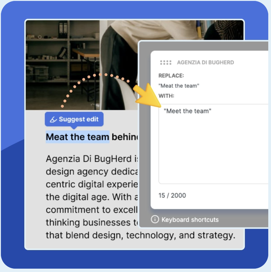
BugHerd is the premier website feedback tool for web designers and developers. It makes it easy for internal teams within agencies, clients, and non-tech users to provide feedback directly on a web page via a digital sticky note.
With BugHerd, anyone can add a note, call out an issue, address a potential problem, or suggest an improvement with a brief comment. Web designers and developers can then view and act on those comments to improve the site before launching and before performing A/B tests.
When it’s finished, show it off! 9 Best Web Developer Portfolio Websites
No matter how new or experienced you are at web design or development, your job is to deliver your client a site that’s engaging, functional, and visually effective.
By leaning into these 11 best principles and practices, you can create a website that will impress both your clients and their customers, keeping them both coming back for more.
Ready to try BugHerd for free? Sign up for a 14-day free trial now.


But don't just take our word for it.
BugHerd is loved by 10,000+ companies,
350,000+ users across 172 countries.
4.8/5
4.7/5
4.5/5
5/5
8.7/10
Sam Duncan 📱📏 🌱
@SamWPaquet
"@bugherd where have you been all my life??
We just migrated our bug tracking over from Asana and have at least halved our software testing time🪳👏📈. "
Ashley Groenveld
Project Manager
“I use BugHerd all day every day. It has sped up our implementation tenfold.”
Sasha Shevelev
Webcoda Co-founder
"Before Bugherd, clients would try to send screenshots with scribbles we couldn't decipher or dozens of emails with issues we were often unable to recreate."
Mark B
Developer
“A no-brainer purchase for any agency or development team.”
Kate L
Director of Operations
"Vital tool for our digital marketing agency.”
Paul Tegall
Delivery Manager
"Loving BugHerd! It's making collecting feedback from non-tech users so much easier."
Daniel Billingham
Senior Product Designer
“The ideal feedback and collaboration tool that supports the needs of clients, designers, project managers, and developers.”
Chris S
CEO & Creative Director
“Our clients LOVE it”
Emily VonSydow
Web Development Director
“BugHerd probably saves us
at least 3-4hrs per week.”