Developers, designers, and clients often find being on the same page (pun not intended) on their vision for the website, well, a mission.
As if ideating for a user-friendly and visually appealing website isn't a big enough task, giving and receiving feedback on page designs is one of the trickier things in web development.
Web development teams often need help in getting clear, accurate, and unreplicable feedback from clients (or each other). And trying to interpret feedback adds another layer of "tricky" to the job.
Contextual feedback plays a massive role in creating a user-friendly and visually appealing website. Communicating the intent of website changes without the need to hop on a call, or take a hundred screenshots that will eventually flood the Slack channel, eliminates the back-and-forths (not to mention work friction and conflicts).
This is what on-page visual design feedback tools can do. They help save time on bug tracking by reducing follow-up questions and capturing the content — all in one central location. Plus, screenshot annotations get everyone on the same page, simplifying communication between developers, designers, and clients.
But more than the tool itself, what's the best way to give and receive feedback when working on website designs?
In this article, we'll show you how to effectively give and receive website design feedback and how tools like BugHerd can help address all the challenges in feedback loops.
Understanding the Importance of Website Design Feedback
The website serves as your digital "shopfront." A clean and well-functioning website signals credibility — your business is legitimate, and your web visitors can trust you.
Clunky design and a buggy website take this credibility away. Ensuring your website always maintains top quality avoids this.
Providing productive feedback on design spells the difference between the most user-friendly websites from ones with high bounce rates, between endless revisions and meeting the project deadline on time.
However, giving and receiving feedback isn't always smooth sailing. Poor design feedback, one that's vague, contradicting, or unjustly critical, can add a lot of stress and friction to the team.
Wrong feedback interpretations could lead to disrupted workflow, delays, and, worst of all, doing it all over again.
Giving constructive feedback on website design involves transparent, open, and clear communication so everyone understands the vision. It saves not only time and effort but also client-agency relationships.
The Website Design Process: Where Feedback Fits In
Following a process ensures your website design reflects a user-friendly and well-functioning digital shopfront for your brands and clients. Website design best practices involve the following steps:
Discovery
Understand the website's goals, target audience, and purpose. Research what competitor sites look like.
If you're part of an in-house web development team, ensure that everyone involved is on the same page with what the website is for. If you're an agency, hop on a discovery call with the client and create a detailed web design brief, including their vision, expectations, and budget.
Make sure the key decision-makers sign off on the brief.
Wireframing and Prototyping
Designers create a wireframe — or a skeletal framework — of each page's layout. In this stage, feedback on usability and functionality would help define the project's direction and identify potential issues early on. Designers then create a prototype, which goes through another round of feedback.
Design and Development
Once wireframes and prototypes are approved, designers and developers create the actual look and feel of the website. When providing feedback at this stage, focus on whether the website follows the prototype to the tee.
Ensure that the design aligns with the branding guidelines — identity, look and feel, tone of voice, etc. Check whether it's visually appealing and provides an excellent user experience.
Testing
Rigorous tests on functionality, performance, and responsiveness define this stage. Feedback should focus on fixing bugs, technical glitches, and design flaws.
Launch
The website goes live! Feedback at this stage will no longer come from the website development team (and client) but from website visitors. User feedback informs future updates and improvements.
Maintenance and Updates
The process continues after the website launch. It's an iterative cycle of design and feedback. The website needs regular updates and maintenance to make sure that it remains relevant and user-friendly. Each round of feedback leads to modifications and improvements.
Best Practices for Providing Website Design Feedback
How can you take your website design from good to exceptional? You guessed it — through an excellent feedback loop. Here's what clear, open, and graceful communication to give and receive feedback looks like:
It's in how you frame your feedback.
The book "Radical Candor" by Kim Scott talks about the difference between that and brutal honesty. Radical candor comes from a place of "caring personally and challenging directly." Brutal honesty? It may be helpful but is often mean and aggressive. The book refers to it as "front stabbing."
Feedback should gear towards continuous improvement with helpfulness and care for others in mind. Nothing should be personal. It hinges on the awareness that your "truth" may not be others'.
Constructive feedback is transparent, open, and intentional.
Focus on the big picture.
Before diving into the nitty gritty, take a step back and consider the website's purpose and overall design.
Are you working on an e-Commerce or a B2B company site? Does the overall design align with the purpose and brand identity? Does it speak to your target audience?
Once you've tackled these overarching questions and considered the fundamentals, you can proceed with the specific design elements.
Make it short and crisp.
Effective feedback is specific and concise. Avoid vague instructions. Instead of saying, "Make the button pop," be clear about the size, color, or font.
Ask yourself: Does the feedback add value? Or does it add confusion? If it's the latter, add more detail to your instructions. See if the additional elements will enhance or clutter the overall design.
Provide feedback with UI and UX design principles in mind.
Before giving feedback on the design elements, take a step back and ask if it reflects vital UI and UX design principles.
Does the design meet the website visitor's needs? Does it reflect the information architecture and goes along the messaging hierarchy? Is it visually appealing? Will users find it easy to navigate? Are you designing with accessibility in mind?
Explain the problem, don’t prescribe the solution.
Each web development team comes with different expertise. While you're free to give suggestions, you can frame your feedback as an open line of communication with teamwork in mind.
As a client, your role is to identify issues, not to design. And as a designer or web developer, you could describe what’s bothering you and check what the client thinks.
Instead of "move this button to the left," you could say: "This button seems lost in the layout. It could be more prominent. Keen to hear your thoughts."
Use visual design feedback tools.
Providing contextual feedback is tricky without the right tools. You may take a hundred screenshots and send them on Slack or email, only for them to get lost along the way or difficult to search for in a few days.
The best website design feedback tools can help streamline the feedback process. They allow you to leave comments, track changes, and document the feedback process in a single, central location — ensuring clarity and efficiency.
When receiving feedback, ask open-ended questions.
Instead of asking questions that elicit simple yes or no answers, ask open-ended ones to get detailed responses. At the same time, focus your question on a specific topic so the client can avoid casting a wide net of issues.
For instance, instead of asking, "What do you think of the overall design?" you can be as granular as focusing on the UX of the homepage: "What areas of the homepage could we improve to enhance UX?"
Evaluate the effectiveness of feedback.
You don't have to take every feedback on board. Assess the feedback based on relevance and clarity. Check if multiple team members consistently provide the same advice. Gauge the value and how much the suggested changes will impact the overall UX.
How to Facilitate Efficient Website Design Feedback
Website design feedback is more than just leaving and applying a few comments. It's a process.
Using client collaboration tools like BugHerd fuels a well-oiled feedback loop, thanks to features that make contextual feedback not just possible but also easy:
Real-Time Visual Feedback
BugHerd lets all the team members leave and see the comments on the actual website page in real-time. This eliminates the need for screenshots, opening a separate platform or tool, and going through lengthy back-and-forths just trying to be on the same page with each other.
BugHerd gets everyone on the same page, literally and figuratively.

Screenshot Annotations
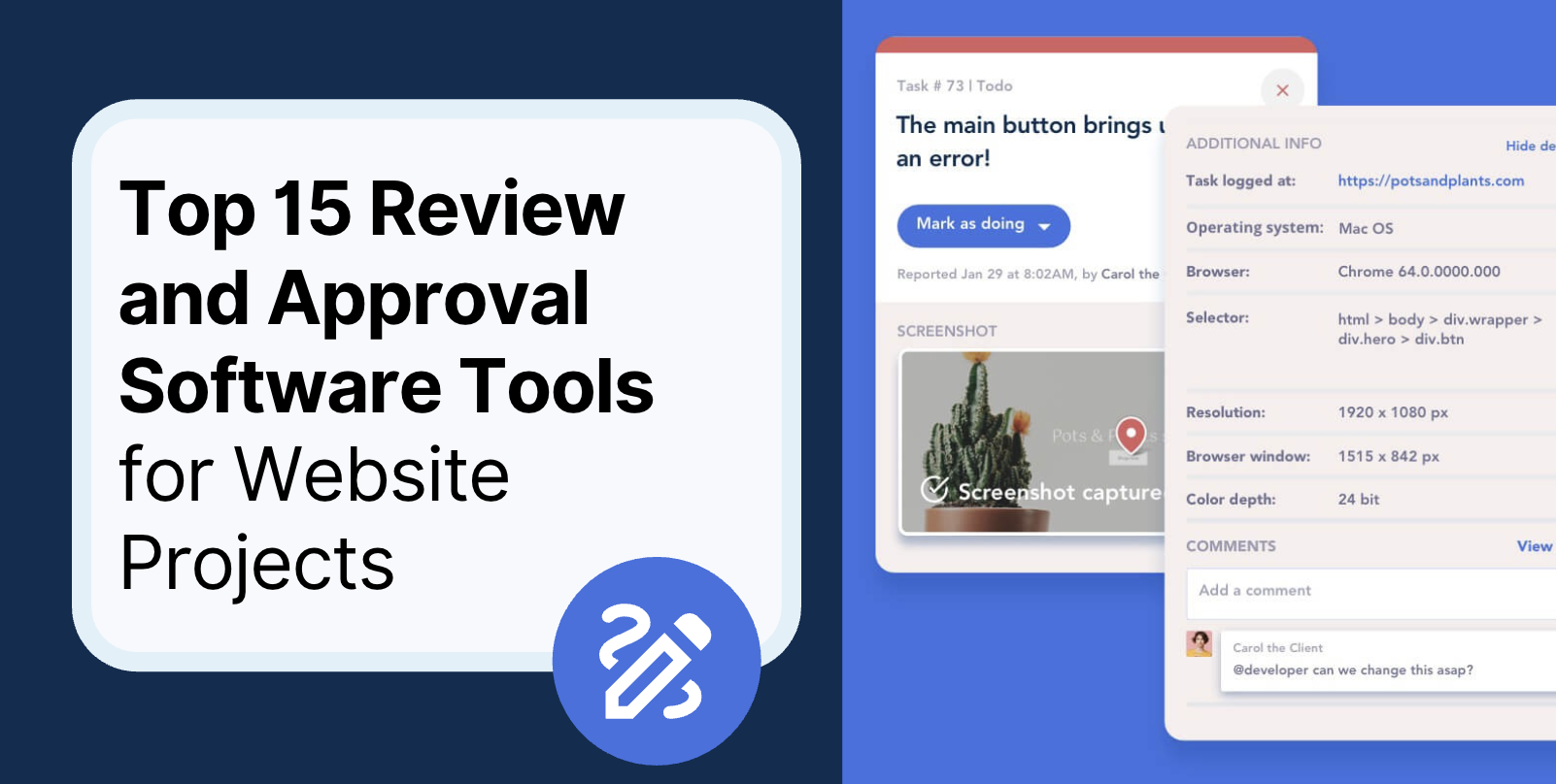
Screenshot annotations help with design changes and contextual feedback. This eliminates any potential misunderstanding and miscommunication, not to mention the time it takes to screenshot and save them on your device.
You can zero in on the specifics of your feedback using annotations.
Centralized Feedback
Because the website interface and feedback are all in one central location, you can simplify communication between designers, developers, and clients. Everyone involved can access and track changes. And you can save time on bug tracking by reducing follow-up questions and capturing the content.

Common Pitfalls in Website Design Feedback and How to Avoid Them
It's easy to provide feedback, but giving effective ones? Tricky. Here are some common pitfalls in website design feedback so you'll know how to avoid them:
Unclear Feedback
"Make the text pop."
"Make sure the CTA button is visible."
These are examples of vague feedback. There can be so many interpretations of them that it leads to confusion and wasted time. To avoid this, go as granular and specific as possible.
"Make the text 2-3 points larger" and "Use a brighter color for the CTA button on the homepage" are better versions of those mentioned above.
Use screenshots and annotations in tools like BugHerd to clearly illustrate your point.
Feedback Getting Lost
This is a common pitfall for teams in the habit of screenshotting hundreds of images and then emailing or flooding the Slack group channel. When the designer or developer needs to refer to the suggested edits, it can take forever to look for them.
To solve this, use a tool with one central location for visual feedback.
Long Feedback Loops and Disorganized Project Management
Long feedback loops happen when instructions get lost in a mountain of screenshots. It also takes place due to delays in giving and acknowledging feedback.
Long feedback loops result in a prolonged design process and missed deadlines. Streamline your overall project management using real-time client collaboration software.
Also, set clear guidelines and expectations for giving and acknowledging feedback.
Frustration and Friction Among Team Members
Differing opinions among team members is okay. Where it goes wrong is when miscommunication often happens, and feedback isn't given constructively.
Establish clear guidelines for providing and receiving feedback. This goes a long way in creating a positive culture of dialogue and open communication.
Streamline Your Website Design Feedback Loop with BugHerd
A successful web development project starts with an effective feedback mechanism involving clear, open communication and a collaborative environment that taps into each team member's expertise.
There's an art to giving and receiving feedback. It involves a balance of productive inputs from team members and clients, plus a well-oiled feedback loop.
We hope this article has addressed any challenges your team may be facing when it comes to website design feedback.
If you need a helping hand to streamline your feedback process, consider BugHerd. It's a tool that many of our users have embedded into their process to provide design feedback efficiently.
BugHerd can significantly simplify your web design workflow and enhance collaboration among team members.
If you're in the middle of a website design project, try BugHerd today!


But don't just take our word for it.
BugHerd is loved by 10,000+ companies,
350,000+ users across 172 countries.
4.8/5
4.7/5
4.5/5
5/5
8.7/10
Sam Duncan 📱📏 🌱
@SamWPaquet
"@bugherd where have you been all my life??
We just migrated our bug tracking over from Asana and have at least halved our software testing time🪳👏📈. "
Ashley Groenveld
Project Manager
“I use BugHerd all day every day. It has sped up our implementation tenfold.”
Sasha Shevelev
Webcoda Co-founder
"Before Bugherd, clients would try to send screenshots with scribbles we couldn't decipher or dozens of emails with issues we were often unable to recreate."
Mark B
Developer
“A no-brainer purchase for any agency or development team.”
Kate L
Director of Operations
"Vital tool for our digital marketing agency.”
Paul Tegall
Delivery Manager
"Loving BugHerd! It's making collecting feedback from non-tech users so much easier."
Daniel Billingham
Senior Product Designer
“The ideal feedback and collaboration tool that supports the needs of clients, designers, project managers, and developers.”
Chris S
CEO & Creative Director
“Our clients LOVE it”
Emily VonSydow
Web Development Director
“BugHerd probably saves us
at least 3-4hrs per week.”