At BugHerd, we create a lot of landing pages. And truthfully many don’t work out the way we initially hope they do.
But because we like to experiment often (and do it in a way that’s informed by data), we are able to uncover a few winners.
For a SaaS business like BugHerd, landing pages play an integral role in getting people to sign up for a free trial of the app. They allow us to personalise how we present our product to different audiences (for example, an eCommerce business will have slightly different needs to a marketing agency).
In this article, I’ll give you an inside glimpse of BugHerd’s process for creating landing pages that convert. I’ll cover the steps we take, some of the key thinking and even the tools that we like to use (and yes, BugHerd is one of them!).
Who am I?
My name is Richy, I am a Product Designer that works across both the product and marketing teams at BugHerd. My primary focus with the marketing team is to increase trial sign up conversions via the marketing website and landing pages. I do this in collaboration with growth marketers, product marketers, illustrators and SEO experts.
What is our process for creating landing pages?
1: We begin by unpacking the problem. This requires answers to a few key questions.
- What is the problem?
The most common problem is a landing page not converting well. I.e. We’ve set a benchmark for trial sign ups, but it’s just not meeting the set goal.
When that occurs, we dig a little deeper to investigate why that may be. Is the messaging confusing or not resonating (i.e. we thought of something important and it’s not)? Are there usability issues? Inadequate social proof on the page? Slow page loading?
We rely on a number of different inputs to find out the answer to these questions, such as heatmaps (which will tell you what people are clicking on and how far they are scrolling down the page) and talking to our users.
- Who is the landing page for?
It’s important to know the idiosyncrasies that drive our audiences, so that we don’t run the risk of pushing ‘features’ that they won’t find relevant. From our experience, landing pages fall short when the message is not inline with the customer’s ‘job’ (in Anthony Ulwick’s definition, a ‘job-to-be-done framework’ is when someone wants to change an existing situation to a preferred one).
For example, a web developer’s job is that they generally want to test and deliver websites as quickly as possible, with as few errors as possible. And from that point of view, we would likely emphasise BugHerd’s feedback experience on our landing pages targeted at web developers. - How do we know if we’ve solved the problem?
More often than not, success is primarily defined by an uptick in the conversion rate of free trial sign ups. However there are times where we also pay attention to bounce rate, time on page and other forms of user behaviour.

- Answer the ‘why’. Why is this landing page important?
A core ‘why’ can act as a north star to guide decision making. For us, the core ‘why’ of creating and optimizing landing pages comes down to the simple idea that more trial sign ups will mean more opportunities to convert BugHerd subscribers.
Answering these key questions help form a brief for the landing page.
2: Design
There are two parts to the design process: ideation and execution.
Ideation is putting pen to paper, and thinking of the different ways we can solve the landing page’s problem area(s). Execution is bringing our best idea(s) to life on our favourite design tools: Sketch and Invision.
BugHerd’s design process invites collaboration from the entire team. It’s not just the job of the designers. And this is in large thanks to the mature state of our design system.

Our design system details a clear set of rules for how the BugHerd website and landing pages should look and behave, as well as offering a library of components to choose from.
This enables the broader team to get involved with thinking about the structure of the page, and what components may be suitable to use. When we’re able to leverage the expertise of the broader marketing team in design, it makes the designers job easier.
3: Build
We create our landing pages in Webflow, a powerful website building tool that provides a visual interface.

4: Peer Review / QA
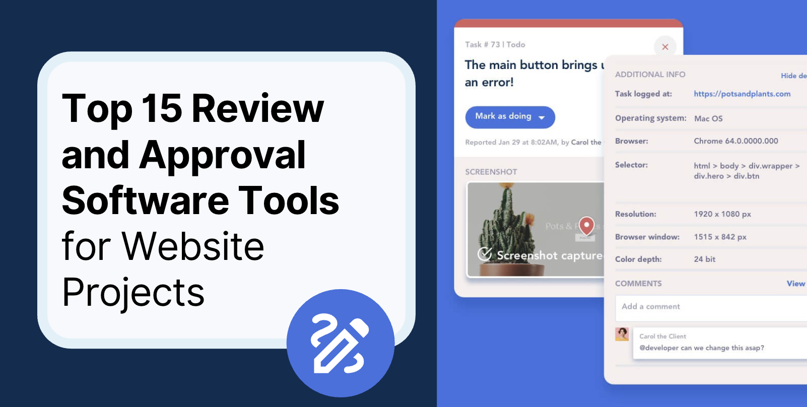
It’s important to conduct a form of peer review / QA before launching a landing page, in order to make sure that there are no errors in the content and that there aren’t any broken links and styling issues.
Not surprisingly, we like to drink our own kool-aid by using BugHerd to capture and manage the feedback.

5: Ship it. Measure it.
After peer review and QA, we’re ready to push the landing page live.
When we are redoing existing landing pages, we are big proponents of AB tests, and for that we use Google Optimize.
Measuring the performance of the legacy landing page vs the new design creates an environment where we can objectively measure the up or down tick in performance.
Summary
1: Unpack the problem (research and definition)
2: Design
3: Build
4: Peer review / QA
5: Ship it. Measure it.
This is our process for creating landing pages. Creating ones that convert however requires patience and continuous practice of experimentation. It’s a discipline, rather than a secret formula.
Experiment often with your landing pages, and you’ll have as good of a chance as any to find a landing page that works for you.




But don't just take our word for it.
BugHerd is loved by 10,000+ companies,
350,000+ users across 172 countries.
4.8/5
4.7/5
4.5/5
5/5
8.7/10
Sam Duncan 📱📏 🌱
@SamWPaquet
"@bugherd where have you been all my life??
We just migrated our bug tracking over from Asana and have at least halved our software testing time🪳👏📈. "
Ashley Groenveld
Project Manager
“I use BugHerd all day every day. It has sped up our implementation tenfold.”
Sasha Shevelev
Webcoda Co-founder
"Before Bugherd, clients would try to send screenshots with scribbles we couldn't decipher or dozens of emails with issues we were often unable to recreate."
Mark B
Developer
“A no-brainer purchase for any agency or development team.”
Kate L
Director of Operations
"Vital tool for our digital marketing agency.”
Paul Tegall
Delivery Manager
"Loving BugHerd! It's making collecting feedback from non-tech users so much easier."
Daniel Billingham
Senior Product Designer
“The ideal feedback and collaboration tool that supports the needs of clients, designers, project managers, and developers.”
Chris S
CEO & Creative Director
“Our clients LOVE it”
Emily VonSydow
Web Development Director
“BugHerd probably saves us
at least 3-4hrs per week.”